Your Website Speaks Loudly
Do you know what it’s saying?
Most of us have heard the idiom, “you can’t judge a book by its cover” hundreds of times in our lives (perhaps more, if your friends think you’re the judge-y one in the group). This saying has a nice sentiment—people and things contain more depth than what a first impression might convey—but here’s the thing about this expression: it’s categorically false.
When you’re walking through a vast library (picture The Reading Room at the British Museum or the stacks at the New York Public Library [yes, we’re nerds, there’s nothing better than a room full of books]) the only thing you can judge a book by is the cover. It’s literally the only part of the book you can interact with until you start reading it. It’s how you know the title; it’s how you know the author. The cover is the mechanism by which we judge whether to even pick up the book.
You and I both know that I’m not just talking about books here, so let’s get right to it. In a digital world, your website is your book cover. What is yours saying about you?
We have worked with a wide variety of institutions over the years, but whether they offer a Bachelor of Arts in International Piracy, or a world-renowned MBA on Ice program, we look at their website first. We want to see how they communicate their brand, mission, and programs. We want to experience what their students experience.
Your website is that important. If you’re skeptical, and thinking to yourself, “well, we have great programs and a world-changing mission, that’s what matters,” consider the following:
A brilliant candidate who earned multiple master’s degrees and a PhD in an obscure field, certified member of MENSA, with 15 years of teaching experience is coming in for an interview with you today. His resume makes him seem like the perfect fit for your institution, but when he arrives to meet the President and the Dean, he is dressed only in a tie-dyed tank top and diamond-encrusted short-shorts. Do you hire him? Or do you, maybe, infer a little bit about the book based on the cover?
Your website says a lot more to your students than what you have written in text. Within 30 seconds of looking at your website, a visitor should be able to determine the following:
You understand how the internet works.
This is CRITICAL for online schools (and, really, for all institutions). If potential students don’t see a modern, appealing, functional website, why would they trust that your LMS is intuitive and navigable? Why would they trust that you’d be able to run an entire school online?
Is your website mobile-compatible? If not, IT. SHOULD. BE.
Is your website accessible? Do your photos have alt text? Do you have closed captions/transcripts on videos? Do you use contrasting colors? Is the site keyboard friendly? Again, if your public-facing website isn’t accessible, why would prospective students trust that your programs would be?
Does your website maximize SEO (search engine optimization)? Can people looking for your institution even find it, or is it buried on the sixth page of Google search results?
Your institution is legitimate.
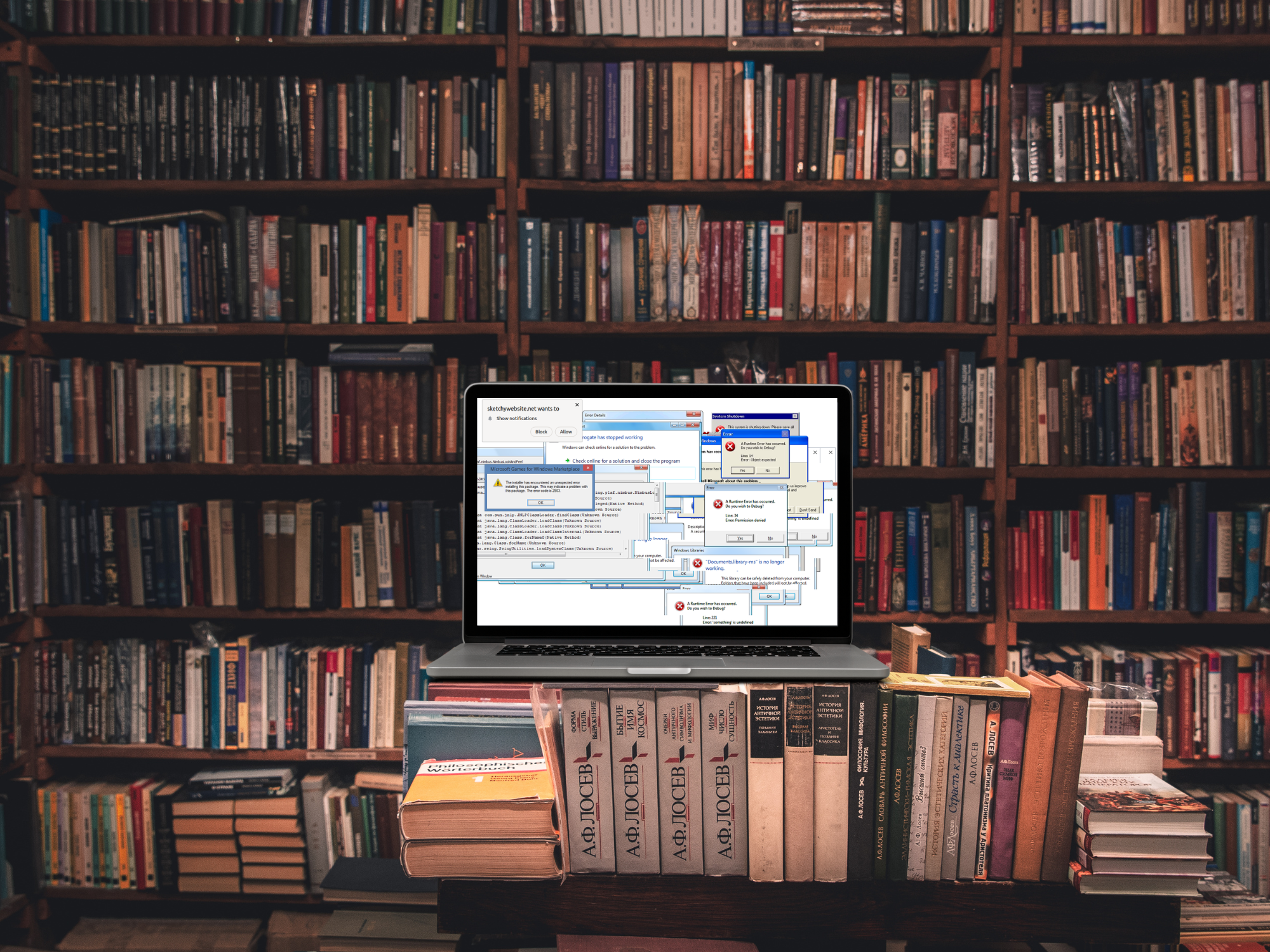
If your URL is something weird, change it. In general, shorter is better (nobody wants to type out OnlineExampleUniversityofWebsiteBestPractices.com.) Ideally, your site will end in .com, .org, or .edu (if accredited). Other less-trusted TLDs (top-level domains) like .biz, .us, and .net don’t present the same legitimacy.
If your layout looks like it’s from 2004, your site will seem sketchy. Put yourself in your prospective students’ shoes—especially if you’re asking for their contact or applicant information. Would you feel comfortable entering your social security number or uploading a scan of your driver’s license into a website that looks like this? (We’ll pick on Yale, since not even the ivy league is immune to the Wayback Machine).
The demographic that attends your school.
Are all your photos generic human beings doing random things? Hopefully not. The photos on your site should be reflective of your institution. If you don’t have original photography, stock photos are okay, but pick photos that represent your mission/programs/outcomes.
If you’re primary student population is working adults, are your photos all of 19-year-olds with backpacks? (Hint: they shouldn’t be).
If your school is online-only, don’t have pictures of people sprawled out on a campus lawn, or meeting together at a cafeteria table—that’s not indicative of what your students are really doing.
How your institution views itself.
Fonts, colors, logos, and layouts all factor into this.
Does your institution see itself as traditional/formal? (Yale’s current website is the poster child for this; University of Pennsylvania is another)
Mixed sans/serif fonts, text-forward, heavy focus on “News”, simple color palette, traditional menu/layout
Or is your institution more artistic and modern (RISD’s site and WWU’s site nail this)?
Bold fonts (caps), design-forward, lots of color/contrast, menu/layout take a backseat to graphics.
What’s important to your institution? If you’re excited about your ground-breaking research, highlight news about relevant studies and publications. If you’re biggest selling point is student satisfaction, share alumni testimonials (after getting their permission, of course). If your claim to fame is job placement, consider featuring an infographic that makes that data visible and understandable.
There is, of course, more to your institution than meets the eye, just like there’s more to a book than its cover—but that doesn’t mean you should ignore the cover. You want people to see that book from across the room and make a b-line for the shelf. Your cover should project legitimacy and your unique identity in an increasingly crowded library; it should welcome users to the content.
Like it or not, your students will judge your institution at least partially by its website. Hubspot recently published their 2022 Consumer Trends Report, which found that websites influence 97% of consumers’ purchasing decisions. That’s almost every single decision. Don’t force students to miss out on what could be a life-changing educational experience by representing yourself poorly.
Also, keep in mind, it’s not just students who will view your site. Accrediting organizations, state licensing boards, prospective employees, competing institutions, potential investors/partners, donors all visit your website to learn more about who, exactly, they’re engaging with. Make sure you are conveying an intentional, cohesive image that truly represents your institution and its mission.
Long story short: You’ve spent time, energy, and resources on building your institution, please don’t alienate or confuse your audience out of discovering and exploring it. Your institution should welcome being judged by its cover. Also, don’t wear diamond-encrusted shorts to (most) higher ed job interviews.